Monday, August 31, 2015

The Final Portrait

So I have been working my ass of and also shown the media explorations to Ms Fu and asked her opinions about my final portrait that I am going to execute in a A3 size. After taking a look of all of my media explorations, Ms Fu suggested to me that its good for me to use the painting technique for the final portrait on a water colour paper or in a canvas. I have come up to my mind to use the water colour paper and mount it on a mounting board because I am planning to use only poster colour instead of acrylic paint. The reason I am not painting in acrylic is because I there is too many shapes I need to paint which is kinda hard and moreover, I am not that good in mixing acrylic colours. So I have painted my face and the body as well by referring the previous A5 portrait I had painted before but with some touch ups. I also painted the background with poster colours as well but with a toned down colour on it to make sure that it is not complicated and overwhelmed. Toning the colour down is just very easy, mixing a lot of white ink into the particular paint to achieve pastel colour. Simple as that!

Here are some of the process of final portraits..


Halfway there!


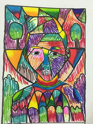
After several hours of paintings and sketching patterns, the end product had came out and it was a relieving day! I had finally finished my first assignment!!! Here's the portrait! Hope u guys liked it!

The Final Portrait of Myself


I've presented it to the class last Tuesday and it was a sigh of relief! It was fun yet challenging during the process of making this portrait.

So here's to sum up my very first Principle of Design's assignment. It was a fun yet challenging week throughout the process of executing this assignment but none of this will work without Ms. Fu's help and suggestions.Thanks a lot Ms Fu! This won't work without you! I hope you guys enjoyed reading my blog and see you guys very soon!


Saturday, August 29, 2015

Media Exploration

Whats up guys! It's time to update my post and here we go! I was asked by Ms Fu to have media exploration on my portraits on an A5 paper size and its was so exciting because I was given a chance to explore what suits my portraits the best. So far, I've explored by using different techniques. For instance, I've tried colour pencil, poster colour, collage, shadings and also highlighting with marker pens. After exploring so many different techniques, I've come to my conclusion that  the poster colouring technique and collaging technique was the toughest and the most time consuming project. It was one of the most challenging project that I have to execute as I need to be neat, precise and most of all, keeping on track of my art movement which is cubism! I guess i shall not write this any longer as I can show you guys the process of this media exploration..Enjoy!


Colour pencil technique


Highlighting technique


Shading and colouring technique


Collaging technique


Poster colour technique


After hours and hours of hard work, I had completed all those exploration in a week and here you go! The final work!


Art Movement: Cubism
Elements of Design: Colour, Shape
Principles of Organisation: Variety 


Art Movement: Cubism
Elements of Design: Colour, Shape, Line
Principals of Organisation :Rhythm, Contrast


Art Movement: Cubism
Elements of Design: Texture, Shape 
Principles of Organisation : Variety 


Art Movement: Cubism 
Elements of Design: Texture, Colour, Shape
Principles of Organisation: Variety, Rhythm


Art Movement: Cubism 
Elements of Design: Texture, Colour, Line
Principle of Organisation: Contrast, Variety

Tuesday, August 25, 2015

Experiences from Week 1!

Greetings to everyone who is reading this blog! I'm Jason from Taylor's The Design School and I am currently blogging this for my Principle Of Design also known as POD subject, led by Ms.Fu. As you can see, this is my first week for my Foundation in Design programme but not my classmates because  I transferred myself from Foundation in Natural Built and Environment (FNBE) to Foundation in Design. Hence, my very first FID class was last Tuesday. I was briefed personally by Ms. Fu  herself about the assignment that my classmates are doing. It was fun yet challenging for me because I need to catch up the assignment's progress as they are in their week 3, whereas I am in my first week. LOL! 

The assignment that was briefed to me was creating two mind maps which is a mind map about myself and a mind map of an art movement that I am gonna refer to a portrait of myself. Moreover, I was also tasked to draw five portraits of myself with different facial expression. It was kinda hard as I am not that good with sketching as compared to my classmates. Honestly, it was a challenge!! The portraits took forever! However, I had so much fun with it as I met some of new crazy friends from my programme. It was an awesome first experience for me!


Here are some mind maps that I had mentioned about..


Mind map about myself... Jason!


The art movement that I had chose which is Cubism


The reason I am choosing Cubism is because the bold colours and edgy shapes that the  Cubist artist execute in just a simple portrait of any objects, models and so much more. Moreover, cubism suits me well because the shapes and colour that are both gutsy and bold that reflects my personality the most. 


In case you guys don't really much about cubism, here are the examples of  some artworks I've found from the internet about the movement.


On the other hand, I was tasked to draw five portraits of myself with different facial expressions and whatnot. Here are some of the sketches I've done to it..:)


Hope you guys liked it! :D