Thursday, June 9, 2016

Assignment 4

Hello everyone! It's me again and now I shall brief all of you for my final assignment for this module!  In this assignment, we have to create a logo of our own company that we are going for and then apply the logo into the items that we are going to have it later.  But first, we just designed a sketch of 30 different logos with no limitation and hence I designed it by hand, drew it and coloured it. Here are the sketch of these 30n different logos.


Sketches 

Logos 

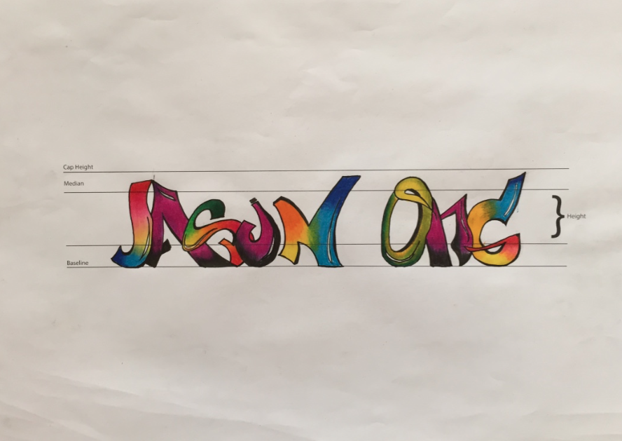
After showing Miss Fu the logos, we are to choose one specific logo that we liked the most and we feel most suitable for our company with. So, I came out with a concept of my own version of corporate company which is an interior design firm and the company is called J group where it represents me. My items will be focused to the items that a office should have, from stationeries to the company's batch and whatnot. Hence, I chose this logo that both Miss Fu and I agreed with because this logo is somehow contemporary yet edgy enough for the company that I am going with. Here it is! 


From this logo I chose, I expended it more the movement, the angles and most importantly colours so that it match my vision and also relevant enough for this project. As a result, I did another 30 sketches to explore more logos so that I found ' the one'. Here are the 30 sketches of this version of my logo! 


Again, I showed and consulted with Miss Fu for more advice and again, I will have to choose another logo that I liked the most for further exploration. Looking at it one by one is confusing as different logo brings different fell for different type of company. Therefore I chose again the logo that both Miss Fu and I agreed again to explore more the shapes and arrangement for the logo but I will have to maintain to the essence of the shape for this logo. Here it is! 


From this logo, I expended the angles and shape only without changing the arrangement of the shapes  anymore as I am almost finalizing the logo. Again, here are the 10 exploration of my logos.


I finished it and to be honest I am not that satisfied with the explorations as I feel that I can't find ' the one' logo and as advised from Miss Fu, I explored more logos but I will emphasised more on the colour gradient of turquoise to white colour which I feel it gives the contemporary feel. Hence, I explored 5 more logos to make sure I found a proper logo that I am happy with. :)


In conclusion I showed Miss Fu again the design and then I designed the logo with the use of AI. I chose this logo and the reason is because I feel that the logo is suitable enough where I think I can go far with it. Here is the logo and the AI version of it! :) 


Hand drawn version 


AI version


Logos in different sizes 

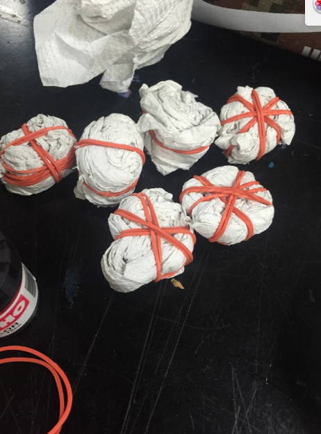
From this logo, I searched and found several items that matched with my company's items. All of my items are mainly matt black in colour and I pasted the logo in these items with stickers only. The items are batch, cylinder, mini garbage bin, stationery organizer, paper stacker, folders, CDs, thumb drives, corck board, mug, letters and a notebook. Several items are sprayed with a matt black spray colour and I printed stickers to paste the stickers on it. Therefore, here are the photo of the completed look!


So hers is the final look for this project! To be honest I am quite happy with the result as we were given a chance to feel like we are the real designers who designed real items and it is definitely nit easy as they are certain challenges that I have to deal with which is coming out a strong concept, dealing with the items and of course searching a good printing shop.  All in all, I would also like to thank to Miss Fu with the bottom of my heart for guiding and helping me  towards of the end of the semester. 


Assignment 3

Hey all! It has been months since my previous post about my assignment's journey and here it is! For the third assignment, we are asked to choose a random topic from a newspaper or use the same chosen topic from assignment 1 and create a headline, sub-headline along with the date. 

So, I choose to pick another new topic as I think I could design a headline which could be more creative and simple. I read through theStar online and found a topic that catches my eye the most. It was about a son that is dead, hung on the wall using only electric cables. When his dad saw him, he thought that he was playing around with him as it was April Fool's day. Turns out his son is confirmed dead and there is no reason behind it. The news is taken during the 5th of April 2016. So I extract the news and make ' Death Prank Gone Wrong' as my title and I rearrange the ' Wrong' into ' Worng' to make and illusion because I wanted the audience to acknowledge my design and be alert of what I am designing. The sub-headline also will be ' Son Found Dead During April Fool's Day' as the date is 5th of April 2016.

The process of designing the headline and sub-headline is not that easy as it seemed. I have to study the spacing, fonts and arrangement so that it is easier and comfortable for the audience to read it. But with Miss Fu's guide, I managed to evolve my design from a moderate and normal looking design into a headline I am satisfied with. Here are the photos of the process of designing my headline into a finalized work! :) 


The Process !

1st Design


2nd Design

3rd Design

4th Design

5th Design

6th Design


Finalized Design


Here is the finalised look as you can see the title I chose is Death Prank Gone Worng with a faded gone from dark red to almost invisible and a rearranged word of wrong to wrong. I hope all of you liked is as much as I enjoy the process of designing it! That's it for now and stay tuned for my last and final assignment for this module! :)


Sunday, March 27, 2016

Weekly Exercise

Ciao everyone and welcome back to my blog! Recently after our assignment 2 , my classmates and I did several excise for tow consecutive weeks and apparently it was fun! Few weeks ago, Ms Fu tasked us to make several tie-dye art on a kitchen towel using colours that chose from assignment 2. It's not crucial for all of us to use all of the colours as some of it is hard to mix and we can't really get it accurately... So here are what tie-dye supposed to look like and the results that has came out after using at the kitchen towel.


After several trials and errors, here are the process in the making my own tie-dye!


Tissue wrapping in order to get the shape of a spiral


And here are some of the selected and mounted using only drawing paper tie-dye kitchen rolls.


After that, we have to create a branding image on a clear plastic bag using magic pens, marker or whatnot using any colours we want to. It may sound easy but coming up with the idea and colouring plastic sheet using marker might be a little hustle for all of us. I choose the idea of Van Gogh's Starry night not only for the aesthetic value but for a purpose as well. I decided to come out with a brand that sells art stationeries, paintings, and coffees that inspired by Van Gogh. It's gonna be mostly focused by his ' Starry  Night' selling items mostly coated with primary colour, mainly blue. Even the coffee gonna be something special too. YES, A BLUE COLOURED COFFEE. It may sound disgusting but that's the concept that I wanna purpose as it feels unique to me. Here are the progress in the making of my plastic bag!

Inspirations

Ideations


Ideations


Ideations

The reason I used the building clipart blocks is because to create the modern era of the cities instead of a village and a tall tall, weirdly-built building in Van Gogh's art.

The process...


'My Starry Night' ,Sharpie on plastic, Mounted on drawing paper


That was the first weekly exercise, the second exercise was to continue the word 'DESIGN' that Miss gave in different types of fonts. Now fonts are not my expertise but I did try my best to make a simple, casual typography and followed the base line. Here are the results....


Typography. Media used: Artline & Copic

Then, she gave us an exercise which is writing our name on a piece that Miss Fu gave and it has guidelines on how tall and where should we end our typo at. I decided to design my name using Graffiti font as I wanna experiment with it because it is my very first time doing it! So I did several research on pinterest and google to make sure how Graffiti really looked like.


Inspirations..

Then, I tried many time designing my name with accuracy and details. Here are the process and its outcome!


'Jason Ong' 0.8 mm Artline and Colour Pencil


So here are all the weekly exercise I have did for these two weeks and I hope you guys enjoyed it! Well stay tuned for more post! :)