Ciao everyone and welcome back to my blog! Recently after our assignment 2 , my classmates and I did several excise for tow consecutive weeks and apparently it was fun! Few weeks ago, Ms Fu tasked us to make several tie-dye art on a kitchen towel using colours that chose from assignment 2. It's not crucial for all of us to use all of the colours as some of it is hard to mix and we can't really get it accurately... So here are what tie-dye supposed to look like and the results that has came out after using at the kitchen towel.


After several trials and errors, here are the process in the making my own tie-dye!
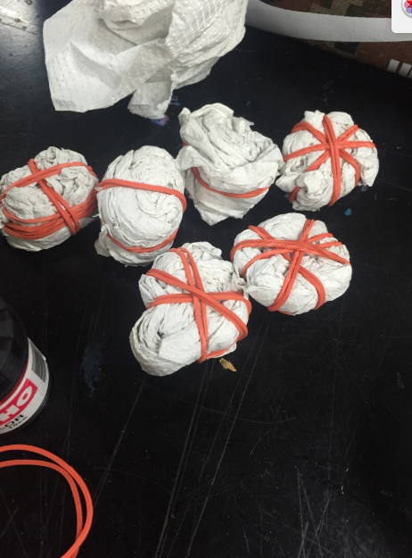 |
| Tissue wrapping in order to get the shape of a spiral |


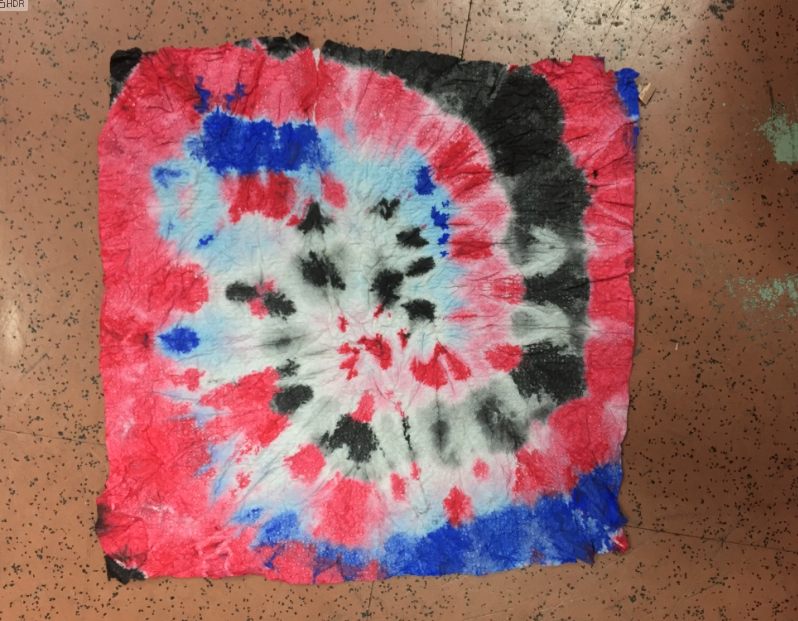

And here are some of the selected and mounted using only drawing paper tie-dye kitchen rolls.


After that, we have to create a branding image on a clear plastic bag using magic pens, marker or whatnot using any colours we want to. It may sound easy but coming up with the idea and colouring plastic sheet using marker might be a little hustle for all of us. I choose the idea of Van Gogh's Starry night not only for the aesthetic value but for a purpose as well. I decided to come out with a brand that sells art stationeries, paintings, and coffees that inspired by Van Gogh. It's gonna be mostly focused by his ' Starry Night' selling items mostly coated with primary colour, mainly blue. Even the coffee gonna be something special too. YES, A BLUE COLOURED COFFEE. It may sound disgusting but that's the concept that I wanna purpose as it feels unique to me. Here are the progress in the making of my plastic bag!
 |
| Inspirations |
 |
| Ideations |
 |
| Ideations |
 |
| Ideations |
The reason I used the building clipart blocks is because to create the modern era of the cities instead of a village and a tall tall, weirdly-built building in Van Gogh's art.
The process...


 |
| 'My Starry Night' ,Sharpie on plastic, Mounted on drawing paper |
That was the first weekly exercise, the second exercise was to continue the word 'DESIGN' that Miss gave in different types of fonts. Now fonts are not my expertise but I did try my best to make a simple, casual typography and followed the base line. Here are the results....

 |
| Typography. Media used: Artline & Copic |
Then, she gave us an exercise which is writing our name on a piece that Miss Fu gave and it has guidelines on how tall and where should we end our typo at. I decided to design my name using Graffiti font as I wanna experiment with it because it is my very first time doing it! So I did several research on pinterest and google to make sure how Graffiti really looked like.


Inspirations..
Then, I tried many time designing my name with accuracy and details. Here are the process and its outcome!

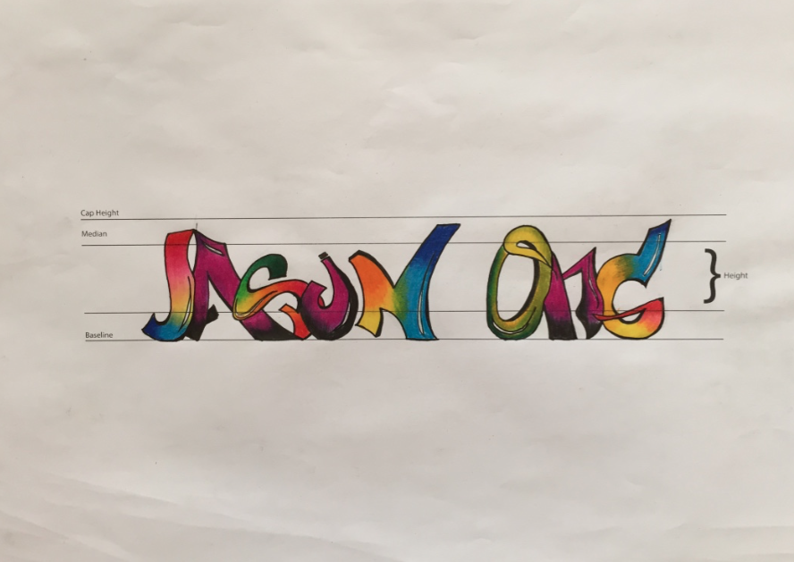 |
| 'Jason Ong' 0.8 mm Artline and Colour Pencil |
So here are all the weekly exercise I have did for these two weeks and I hope you guys enjoyed it! Well stay tuned for more post! :)
No comments:
Post a Comment